In Part 23, let’s see how to use qplot to create a simple scatterplot.
The qplot (quick plot) system is a subset of the ggplot2 (grammar of graphics) package which you can use to create nice graphs. It is great for creating graphs of categorical data, because you can map symbol colour, size and shape to the levels of your categorical variable. To use qplot first install ggplot2 as follows:
install.packages("ggplot2")
and then load ggplot2 using the command:
library(ggplot2)
The qplot syntax is as follows:
qplot(x = X, y = X, data = X, colour = X, shape = X, geom = X, main = "Title")
where x gives the x values you wish to plot.
y gives the y values you wish to plot. You now have bivariate data and must provide an appropriate geom.
data gives the object name of the data frame.
colour maps the colour scheme onto a factor variable, and qplot now selects different colours for different levels of the variable. You can use special syntax to set your own colours.
shape maps the symbol shapes onto a factor variable, and qplot now selects different shapes for different levels of the factor variable. You can use special syntax to set your own shapes.
geom provides a list of keywords that control the kind of plot, including: “histogram“, “density“, “line“, “point“.
main provides the title for the plot.
In qplot, you can set your desired aesthetics using the operator I(). For example, if you want red use: color = I("red"). If you want to control the size of the symbols, use: size = I(N), where a value of N greater than 1 expands the symbols. For example, size = I(5) produces very big symbols.
Anyway – let’s start with a simple example where we set up a simple scatterplot with blue symbols. Now read in this dataset:
T <- structure(list(A = c(1, 2, 4, 5, 6, 7), B = c(1, 4, 16, 25, 36, 49)), .Names = c("A", "B"), row.names = c(NA, -6L), class = "data.frame")
T

Now plot A against B using I() for colour and symbol size. We include axis labels of our choice and use symbol size 5 (large symbols).
qplot(A, B, data = T, xlab = "NUMBERS", ylab = "VERTICAL AXIS", colour = I("blue"), size = I(5))
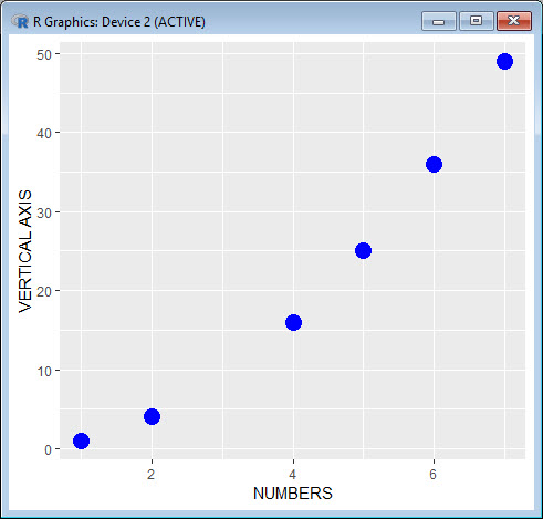
Note the default background, grey in colour and including a grid. We can modify those attributes quite easily and we will do so in a later blog
Now we create a scatterplot with a smooth curve using geom = c("smooth").
qplot(A, B, data = T, xlab = "NUMBERS", ylab = "VERTICAL AXIS", colour = I("blue"), size = I(1), geom = c("smooth"))
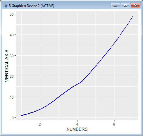
We chose size = I(1) for this example, but we can include a larger value to get a thicker line.
That wasn’t so hard! In Blog 24 we will look at further plotting techniques using qplot.
See you later!
David
Annex: R codes used
[code lang=”r”]
# Install ggplot2 package.
install.packages("ggplot2")
# Load ggplot2 package.
library(ggplot2)
# Read in and display the dataset.
T <- structure(list(A = c(1, 2, 4, 5, 6, 7), B = c(1, 4, 16, 25, 36, 49)), .Names = c("A", "B"), row.names = c(NA, -6L), class = "data.frame")
T
# Plot A against B.
qplot(A, B, data = T, xlab = "NUMBERS", ylab = "VERTICAL AXIS", colour = I("blue"), size = I(5))
# Create a scatterplot with a smooth curve.
qplot(A, B, data = T, xlab = "NUMBERS", ylab = "VERTICAL AXIS", colour = I("blue"), size = I(1), geom = c("smooth"))
[/code]

Senior Academic Manager in New Zealand Institute of Sport and Director of Sigma Statistics and Research Ltd. Author of the book: R Graph Essentials.